原文:Collapse
いくつかのクラスと私たちのJavaScriptプラグインにより、あなたのプロジェクト全体のコンテンツの表示属性を切り換えます。
例
クラス変更を通して、他の要素を表示、非表示するために、以下のボタンをクリックします。:
- .collapseは、コンテンツを隠します
- .collapsingは、遷移の間、適用されます
- .collapse.showは、コンテンツを表示します
あなたは、href属性を持つリンク、あるいは、data-target属性を持つボタンを使用することができます。どちらの場合も、data-toggle="collapse"が、必要です。
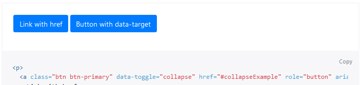
<p>
  <a class="btn btn-primary" data-toggle="collapse" href="#collapseExample" role="button" aria-expanded="false" aria-controls="collapseExample">
    Link with href
  </a>
  <button class="btn btn-primary" type="button" data-toggle="collapse" data-target="#collapseExample" aria-expanded="false" aria-controls="collapseExample">
    Button with data-target
  </button>
</p>
<div class="collapse" id="collapseExample">
  <div class="card card-body">
    Anim pariatur cliche reprehenderit, enim eiusmod high life accusamus terry richardson ad squid. Nihil anim keffiyeh helvetica, craft beer labore wes anderson cred nesciunt sapiente ea proident.
  </div>
</div>
複数の目標
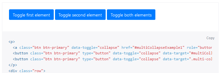
<button>や<a>は、そのhrefやdata-target属性で、jQueryのセレクタを持つそれらを参照することで、複数の要素を表示、非表示にすることができます。複数の<button>や<a>は、それらが、hrefやdata-target属性で、それぞれそれを参照する場合、要素を表示、非表示にすることができます。
<p>
  <a class="btn btn-primary" data-toggle="collapse" href="#multiCollapseExample1" role="button" aria-expanded="false" aria-controls="multiCollapseExample1">Toggle first element</a>
  <button class="btn btn-primary" type="button" data-toggle="collapse" data-target="#multiCollapseExample2" aria-expanded="false" aria-controls="multiCollapseExample2">Toggle second element</button>
  <button class="btn btn-primary" type="button" data-toggle="collapse" data-target=".multi-collapse" aria-expanded="false" aria-controls="multiCollapseExample1 multiCollapseExample2">Toggle both elements</button>
</p>
<div class="row">
  <div class="col">
    <div class="collapse multi-collapse" id="multiCollapseExample1">
      <div class="card card-body">
        Anim pariatur cliche reprehenderit, enim eiusmod high life accusamus terry richardson ad squid. Nihil anim keffiyeh helvetica, craft beer labore wes anderson cred nesciunt sapiente ea proident.
      </div>
    </div>
  </div>
  <div class="col">
    <div class="collapse multi-collapse" id="multiCollapseExample2">
      <div class="card card-body">
        Anim pariatur cliche reprehenderit, enim eiusmod high life accusamus terry richardson ad squid. Nihil anim keffiyeh helvetica, craft beer labore wes anderson cred nesciunt sapiente ea proident.
      </div>
    </div>
  </div>
</div>
アコーディオンの例
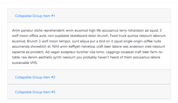
cardコンポーネントを使用して、あなたは、アコーディオンを作成する、デフォルトの折り畳み動作を拡張できます。
<div id="accordion">
  <div class="card">
    <div class="card-header" id="headingOne">
      <h5 class="mb-0">
        <button class="btn btn-link" data-toggle="collapse" data-target="#collapseOne" aria-expanded="true" aria-controls="collapseOne">
          Collapsible Group Item #1
        </button>
      </h5>
    </div>

    <div id="collapseOne" class="collapse show" aria-labelledby="headingOne" data-parent="#accordion">
      <div class="card-body">
        Anim pariatur cliche reprehenderit, enim eiusmod high life accusamus terry richardson ad squid. 3 wolf moon officia aute, non cupidatat skateboard dolor brunch. Food truck quinoa nesciunt laborum eiusmod. Brunch 3 wolf moon tempor, sunt aliqua put a bird on it squid single-origin coffee nulla assumenda shoreditch et. Nihil anim keffiyeh helvetica, craft beer labore wes anderson cred nesciunt sapiente ea proident. Ad vegan excepteur butcher vice lomo. Leggings occaecat craft beer farm-to-table, raw denim aesthetic synth nesciunt you probably haven't heard of them accusamus labore sustainable VHS.
      </div>
    </div>
  </div>
  <div class="card">
    <div class="card-header" id="headingTwo">
      <h5 class="mb-0">
        <button class="btn btn-link collapsed" data-toggle="collapse" data-target="#collapseTwo" aria-expanded="false" aria-controls="collapseTwo">
          Collapsible Group Item #2
        </button>
      </h5>
    </div>
    <div id="collapseTwo" class="collapse" aria-labelledby="headingTwo" data-parent="#accordion">
      <div class="card-body">
        Anim pariatur cliche reprehenderit, enim eiusmod high life accusamus terry richardson ad squid. 3 wolf moon officia aute, non cupidatat skateboard dolor brunch. Food truck quinoa nesciunt laborum eiusmod. Brunch 3 wolf moon tempor, sunt aliqua put a bird on it squid single-origin coffee nulla assumenda shoreditch et. Nihil anim keffiyeh helvetica, craft beer labore wes anderson cred nesciunt sapiente ea proident. Ad vegan excepteur butcher vice lomo. Leggings occaecat craft beer farm-to-table, raw denim aesthetic synth nesciunt you probably haven't heard of them accusamus labore sustainable VHS.
      </div>
    </div>
  </div>
  <div class="card">
    <div class="card-header" id="headingThree">
      <h5 class="mb-0">
        <button class="btn btn-link collapsed" data-toggle="collapse" data-target="#collapseThree" aria-expanded="false" aria-controls="collapseThree">
          Collapsible Group Item #3
        </button>
      </h5>
    </div>
    <div id="collapseThree" class="collapse" aria-labelledby="headingThree" data-parent="#accordion">
      <div class="card-body">
        Anim pariatur cliche reprehenderit, enim eiusmod high life accusamus terry richardson ad squid. 3 wolf moon officia aute, non cupidatat skateboard dolor brunch. Food truck quinoa nesciunt laborum eiusmod. Brunch 3 wolf moon tempor, sunt aliqua put a bird on it squid single-origin coffee nulla assumenda shoreditch et. Nihil anim keffiyeh helvetica, craft beer labore wes anderson cred nesciunt sapiente ea proident. Ad vegan excepteur butcher vice lomo. Leggings occaecat craft beer farm-to-table, raw denim aesthetic synth nesciunt you probably haven't heard of them accusamus labore sustainable VHS.
      </div>
    </div>
  </div>
</div>
アクセスしやすさ
コントロール要素に、aria-expandedを必ず追加してください。 この属性は、コントロールに紐付けされたcollapsible要素の現在の状態を、スクリーン・リーダーと類似した支援技術に明示的に伝えます。collapsible要素が、既定で閉じている場合、コントロール要素上の属性は、aria-expanded="false"の値を持つ必要があります。あなたが、showクラスを使用して、既定で開くようにcollapsible要素を設定した場合、代わりにコントロールに、aria-expanded="true"を設定します。プラグインは、collapsible要素が開かれているか、閉じたているかどうかに基づいて、コントロールで、この属性を自動的に切り換えます。(JavaScriptを通して、あるいは、また、ユーザーが、同じcollapsbile要素と結びつく他のコントロール要素を起動したため)。コントロール要素のHTML要素が、(<a>や<div>のような)ボタンでない場合、属性role="button"を、要素に追加する必要があります。
あなたのコントロール要素が、一つのcollapsible要素を対象としている場合、-すなわち、data-target属性は、IDセレクタに指定されています-あなたは、コントロール要素に、collapsible要素のidが含まれているaria-controls属性を追加する必要があります。最新のスクリーン・リーダーと類似した支援技術は、この属性を使用して、ユーザーに提供するcollapsible要素そのものに直接移動する追加のショートカットを作成します。
Bootstrapの現在の実装では、WAI-ARIA Authoring Practices 1.1アコーディオン・パターンで説明される、さまざまなキーボード相互作用が取り扱われていないことに注意して下さい。-あなたは、カスタムJavaScriptで、あなた自身で、これらを組み込む必要があります。
使用法:
collapseプラグインは、面倒な作業を処理するために、いくつかのクラスを利用します:
- .collapseは、コンテンツを隠します
- .collapse.showは、コンテンツを表示します
- .collapsingが、遷移が開始され、削除されたとき、それが、完了するとき、追加されます。
これらのクラスは、_transitions.scssで見つかります。
Via data attributes
自動的に1つ以上のcollapsible要素のコントロールを割り当てるために、要素にdata-toggle="collapse"とdata-targetを追加します。 data-target属性は、折り畳みを適用するCSSセレクタを扱います。collapsible要素に、クラスcollapseを必ず追加してください。あなたが、デフォルトで、openにしたい場合、追加のクラスshowを追加します。
アコーディオンのようなグループ管理をcollapsible領域に追加するために、データ属性data-parent="#selector"を追加します。動作で、これを確かめるデモを参照してください。
JavaScriptを通して
オプション
オプションは、データ属性やJavaScriptを使用して渡すことができます。データ属性のために、data-parent=""のように、data-に、オプションの名前を添付します。
| 名前 | 型 | デフォルト | 解説 |
|---|---|---|---|
| parent | selector | jQuery object | DOM element | false | 親が提供されている場合、続いて、指定された親の下のすべてのcollapsible要素は、このcollapsible項目が、表示されるとき、閉じられています。(従来のアコーディオンの振る舞いと同様、-これは、クラスcardに依存しています)。属性は、対象とするcollapsible領域で設定されている必要があります。 |
| toggle | boolean | true | 呼出しで、collapsible要素を切り換えます |
メソッド
非同期メソッドと遷移
Asynchronous methods and transitions
すべてのAPIメソッドは、非同期で遷移を開始します。それらは、移行が開始されるとすぐに、終了する前に呼び出し元に戻ります。さらに、遷移コンポーネントのメソッド呼び出しは無視されます。
.collapse('toggle')
.collapse('show')
collapsible要素を表示します。collapsible要素が、実際に、表示になる前に、呼び出し側に戻します。(すなわち、shown.bs.collapseイベントが発生する前に)。
.collapse('hide')
collapsible要素を隠します。collapsible要素が、実際に、非表示になる前に、呼び出し側に戻します。(すなわち、hidden.bs.collapseイベントが発生する前に)。
.collapse('dispose')
要素の折り畳みを無効にします。
イベント
Bootstrapのcollapseクラスは、折り畳み機能にフックするため、いくつかのイベントを公開しています。
| Event型 | 解説 |
|---|---|
| show.bs.collapse | 表示インスタンス・メソッドが、呼び出されるとき、このイベントは、すぐに発生します。 |
| shown.bs.collapse | このイベントが、ユーザーに、collapse要素が表示されたとき、発生します。(CSS遷移が完了するのを待ちます)。 |
| hide.bs.collapse | hideメソッドが、呼ばれたとき、このイベントは、すぐに、発生します。 |
| hidden.bs.collapse | collapse要素が、ユーザーから隠されたとき、このイベントが起動されます。(CSS遷移が完了するのを待ちます)。 |
$('#myCollapsible').on('hidden.bs.collapse', function () {
  // do something…
})