原文:Tables
Bootstrapによる表(それらは、一般的に、JavaScriptプラグインを使用して、与えられる)の選択スタイル調整のためのドキュメントと例。
例
カレンダーと日付ピッカーのような、サードパーティ製のウィジェットの中を広範囲に表で使用するため、私たちは、選択できる表を設計しました。どの<table>にも、基底クラス.tableを追加します。そして、カスタム・スタイルやさまざまな組み込み修飾クラスを拡張します。
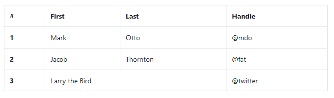
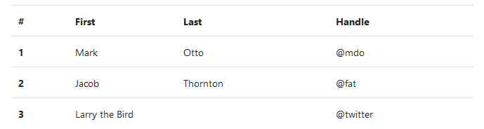
最も基本的な表マークアップを使用して、ここに、Bootstrapの.tableに基づいた表が、どのように見えるかを示します。すべての表のスタイルは、Bootstrap 4で継承されます。つまり、入れ子された表は、親と同じスタイルになります。
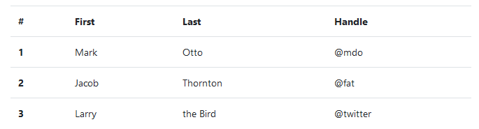
<table class="table">
<thead>
<tr>
<th scope="col">#</th>
<th scope="col">First</th>
<th scope="col">Last</th>
<th scope="col">Handle</th>
</tr>
</thead>
<tbody>
<tr>
<th scope="row">1</th>
<td>Mark</td>
<td>Otto</td>
<td>@mdo</td>
</tr>
<tr>
<th scope="row">2</th>
<td>Jacob</td>
<td>Thornton</td>
<td>@fat</td>
</tr>
<tr>
<th scope="row">3</th>
<td>Larry</td>
<td>the Bird</td>
<td>@twitter</td>
</tr>
</tbody>
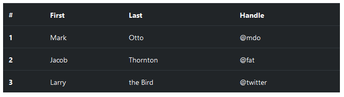
</table>また、あなたは、.table-darkで、暗い背景の上に明色のテキストで、色を反転させることができます。
<table class="table table-dark">
<thead>
<tr>
<th scope="col">#</th>
<th scope="col">First</th>
<th scope="col">Last</th>
<th scope="col">Handle</th>
</tr>
</thead>
<tbody>
<tr>
<th scope="row">1</th>
<td>Mark</td>
<td>Otto</td>
<td>@mdo</td>
</tr>
<tr>
<th scope="row">2</th>
<td>Jacob</td>
<td>Thornton</td>
<td>@fat</td>
</tr>
<tr>
<th scope="row">3</th>
<td>Larry</td>
<td>the Bird</td>
<td>@twitter</td>
</tr>
</tbody>
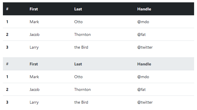
</table>テーブル・ヘッダ・オプション
表と暗い表と同様に、<thead>を明るく、あるいは、暗い灰色で表示するために、修飾クラス.thead-lightや.thead-darkを使用します。
<table class="table">
<thead class="thead-dark">
<tr>
<th scope="col">#</th>
<th scope="col">First</th>
<th scope="col">Last</th>
<th scope="col">Handle</th>
</tr>
</thead>
<tbody>
<tr>
<th scope="row">1</th>
<td>Mark</td>
<td>Otto</td>
<td>@mdo</td>
</tr>
<tr>
<th scope="row">2</th>
<td>Jacob</td>
<td>Thornton</td>
<td>@fat</td>
</tr>
<tr>
<th scope="row">3</th>
<td>Larry</td>
<td>the Bird</td>
<td>@twitter</td>
</tr>
</tbody>
</table>
<table class="table">
<thead class="thead-light">
<tr>
<th scope="col">#</th>
<th scope="col">First</th>
<th scope="col">Last</th>
<th scope="col">Handle</th>
</tr>
</thead>
<tbody>
<tr>
<th scope="row">1</th>
<td>Mark</td>
<td>Otto</td>
<td>@mdo</td>
</tr>
<tr>
<th scope="row">2</th>
<td>Jacob</td>
<td>Thornton</td>
<td>@fat</td>
</tr>
<tr>
<th scope="row">3</th>
<td>Larry</td>
<td>the Bird</td>
<td>@twitter</td>
</tr>
</tbody>
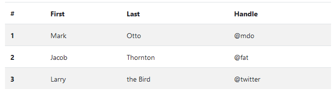
</table>しま模様の行
<tbody>の範囲内で、表の行に縞模様を追加するために、.table-stripedを使用します。
<table class="table table-striped">
  <thead>
    <tr>
      <th scope="col">#</th>
      <th scope="col">First</th>
      <th scope="col">Last</th>
      <th scope="col">Handle</th>
    </tr>
  </thead>
  <tbody>
    <tr>
      <th scope="row">1</th>
      <td>Mark</td>
      <td>Otto</td>
      <td>@mdo</td>
    </tr>
    <tr>
      <th scope="row">2</th>
      <td>Jacob</td>
      <td>Thornton</td>
      <td>@fat</td>
    </tr>
    <tr>
      <th scope="row">3</th>
      <td>Larry</td>
      <td>the Bird</td>
      <td>@twitter</td>
    </tr>
  </tbody>
</table>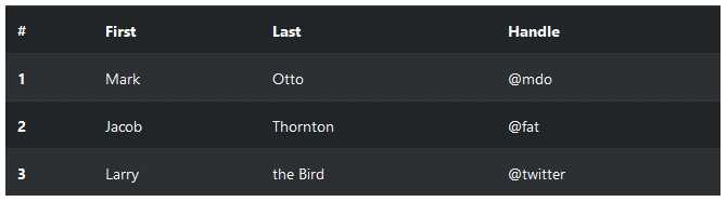
<table class="table table-striped table-dark">
  <thead>
    <tr>
      <th scope="col">#</th>
      <th scope="col">First</th>
      <th scope="col">Last</th>
      <th scope="col">Handle</th>
    </tr>
  </thead>
  <tbody>
    <tr>
      <th scope="row">1</th>
      <td>Mark</td>
      <td>Otto</td>
      <td>@mdo</td>
    </tr>
    <tr>
      <th scope="row">2</th>
      <td>Jacob</td>
      <td>Thornton</td>
      <td>@fat</td>
    </tr>
    <tr>
      <th scope="row">3</th>
      <td>Larry</td>
      <td>the Bird</td>
      <td>@twitter</td>
    </tr>
  </tbody>
</table>
縁取りされた表
表とセルのすべての側面の上の縁取りのために、.table-borderedを追加します。
<table class="table table-bordered">
  <thead>
    <tr>
      <th scope="col">#</th>
      <th scope="col">First</th>
      <th scope="col">Last</th>
      <th scope="col">Handle</th>
    </tr>
  </thead>
  <tbody>
    <tr>
      <th scope="row">1</th>
      <td>Mark</td>
      <td>Otto</td>
      <td>@mdo</td>
    </tr>
    <tr>
      <th scope="row">2</th>
      <td>Jacob</td>
      <td>Thornton</td>
      <td>@fat</td>
    </tr>
    <tr>
      <th scope="row">3</th>
      <td colspan="2">Larry the Bird</td>
      <td>@twitter</td>
    </tr>
  </tbody>
</table>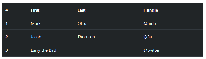
<table class="table table-bordered table-dark">
  <thead>
    <tr>
      <th scope="col">#</th>
      <th scope="col">First</th>
      <th scope="col">Last</th>
      <th scope="col">Handle</th>
    </tr>
  </thead>
  <tbody>
    <tr>
      <th scope="row">1</th>
      <td>Mark</td>
      <td>Otto</td>
      <td>@mdo</td>
    </tr>
    <tr>
      <th scope="row">2</th>
      <td>Jacob</td>
      <td>Thornton</td>
      <td>@fat</td>
    </tr>
    <tr>
      <th scope="row">3</th>
      <td colspan="2">Larry the Bird</td>
      <td>@twitter</td>
    </tr>
  </tbody>
</table>
ホバー可能な行
Hoverable rows
<tbody>内の表の行の上で、ホバー状態を有効にするために、.table-hoverを追加します。
<table class="table table-hover">
  <thead>
    <tr>
      <th scope="col">#</th>
      <th scope="col">First</th>
      <th scope="col">Last</th>
      <th scope="col">Handle</th>
    </tr>
  </thead>
  <tbody>
    <tr>
      <th scope="row">1</th>
      <td>Mark</td>
      <td>Otto</td>
      <td>@mdo</td>
    </tr>
    <tr>
      <th scope="row">2</th>
      <td>Jacob</td>
      <td>Thornton</td>
      <td>@fat</td>
    </tr>
    <tr>
      <th scope="row">3</th>
      <td colspan="2">Larry the Bird</td>
      <td>@twitter</td>
    </tr>
  </tbody>
</table>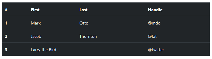
<table class="table table-hover table-dark">
  <thead>
    <tr>
      <th scope="col">#</th>
      <th scope="col">First</th>
      <th scope="col">Last</th>
      <th scope="col">Handle</th>
    </tr>
  </thead>
  <tbody>
    <tr>
      <th scope="row">1</th>
      <td>Mark</td>
      <td>Otto</td>
      <td>@mdo</td>
    </tr>
    <tr>
      <th scope="row">2</th>
      <td>Jacob</td>
      <td>Thornton</td>
      <td>@fat</td>
    </tr>
    <tr>
      <th scope="row">3</th>
      <td colspan="2">Larry the Bird</td>
      <td>@twitter</td>
    </tr>
  </tbody>
</table>
小さな表
<table class="table table-sm">
  <thead>
    <tr>
      <th scope="col">#</th>
      <th scope="col">First</th>
      <th scope="col">Last</th>
      <th scope="col">Handle</th>
    </tr>
  </thead>
  <tbody>
    <tr>
      <th scope="row">1</th>
      <td>Mark</td>
      <td>Otto</td>
      <td>@mdo</td>
    </tr>
    <tr>
      <th scope="row">2</th>
      <td>Jacob</td>
      <td>Thornton</td>
      <td>@fat</td>
    </tr>
    <tr>
      <th scope="row">3</th>
      <td colspan="2">Larry the Bird</td>
      <td>@twitter</td>
    </tr>
  </tbody>
</table>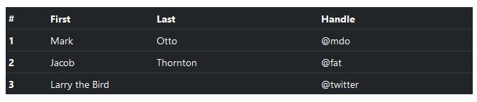
<table class="table table-sm">
<thead>
<tr>
<th scope="col">#</th>
<th scope="col">First</th>
<th scope="col">Last</th>
<th scope="col">Handle</th>
</tr>
</thead>
<tbody>
<tr>
<th scope="row">1</th>
<td>Mark</td>
<td>Otto</td>
<td>@mdo</td>
</tr>
<tr>
<th scope="row">2</th>
<td>Jacob</td>
<td>Thornton</td>
<td>@fat</td>
</tr>
<tr>
<th scope="row">3</th>
<td colspan="2">Larry the Bird</td>
<td>@twitter</td>
</tr>
</tbody>
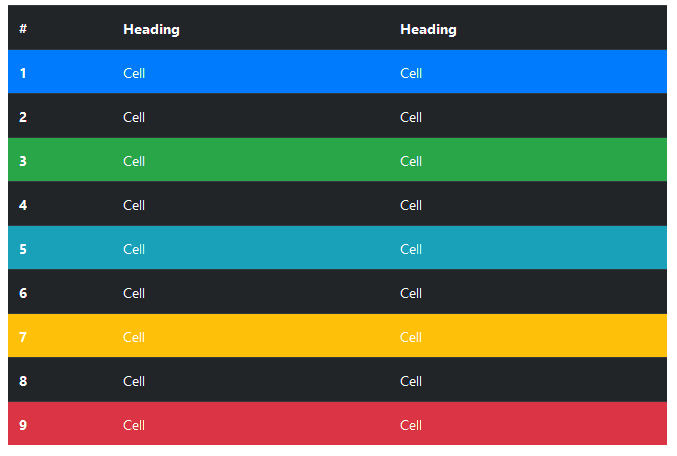
</table>コンテクスト・クラス
表の行やそれぞれのセルに色を付けるために、コンテクスト・クラスを使用します。
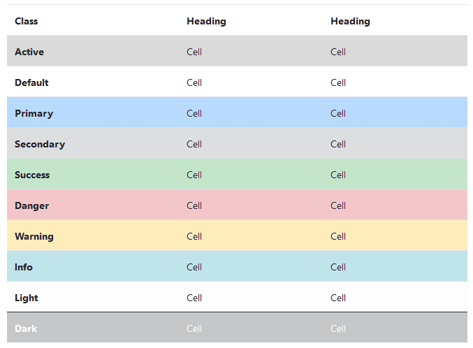
<!-- On rows -->
<tr class="table-active">...</tr>

<tr class="table-primary">...</tr>
<tr class="table-secondary">...</tr>
<tr class="table-success">...</tr>
<tr class="table-danger">...</tr>
<tr class="table-warning">...</tr>
<tr class="table-info">...</tr>
<tr class="table-light">...</tr>
<tr class="table-dark">...</tr>

<!-- On cells (`td` or `th`) -->
<tr>
  <td class="table-active">...</td>

  <td class="table-primary">...</td>
  <td class="table-secondary">...</td>
  <td class="table-success">...</td>
  <td class="table-danger">...</td>
  <td class="table-warning">...</td>
  <td class="table-info">...</td>
  <td class="table-light">...</td>
  <td class="table-dark">...</td>
</tr>通常の表の背景のバリアントは、暗い表で利用できません。しかしながら、あなたは、同様のスタイルを実現するために、テキストやバックグラウンド・ユーティリティを使用することができます。
<!-- On rows -->
<tr class="bg-primary">...</tr>
<tr class="bg-success">...</tr>
<tr class="bg-warning">...</tr>
<tr class="bg-danger">...</tr>
<tr class="bg-info">...</tr>

<!-- On cells (`td` or `th`) -->
<tr>
  <td class="bg-primary">...</td>
  <td class="bg-success">...</td>
  <td class="bg-warning">...</td>
  <td class="bg-danger">...</td>
  <td class="bg-info">...</td>
</tr>
支援技術に意味を伝える
Conveying meaning to assistive technologies
スクリーン・リーダーのような、外観を提供するだけの意味を追加するために、色を使用すると、それは、支援技術から、ユーザーに伝達されません。.sr-onlyクラスで隠されている追加のテキストのような、(表示されるテキストのような)内容そのものから明らか、あるいは、代替手段が含まれられている色によって、情報が表示されていることを確認します。
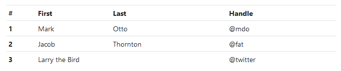
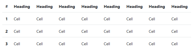
.table-responsive{-sm|-md|-lg|-xl}で.tableをラップすることで、レスポンシブな表を作成します。それぞれ、575.99px、767.99px、991.99px、および1119.99pxの各最大幅のブレークポイントで、テーブルを水平にスクロールします。
ブラウザが、現在、範囲コンテキスト・クエリをサポートしていないことに、注意して下さい。私たちは、これらの比較の精度が高い値を使用して、小数の幅でmin-とmax-接頭辞とビューポートの制限を回避します。(例えば、高dpiデバイス上の特定の条件下で発生する可能性があります)
キャプション
<caption>は、表の見出しのように機能します。読みたい場合、表を見つけ、それが、何であるか理解し、決定するために、スクリーン・リーダーで役に立ちます。
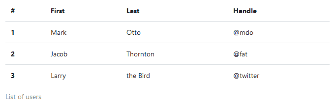
<table class="table">
  <caption>List of users</caption>
  <thead>
    <tr>
      <th scope="col">#</th>
      <th scope="col">First</th>
      <th scope="col">Last</th>
      <th scope="col">Handle</th>
    </tr>
  </thead>
  <tbody>
    <tr>
      <th scope="row">1</th>
      <td>Mark</td>
      <td>Otto</td>
      <td>@mdo</td>
    </tr>
    <tr>
      <th scope="row">2</th>
      <td>Jacob</td>
      <td>Thornton</td>
      <td>@fat</td>
    </tr>
    <tr>
      <th scope="row">3</th>
      <td>Larry</td>
      <td>the Bird</td>
      <td>@twitter</td>
    </tr>
  </tbody>
</table>
レスポンシブ表
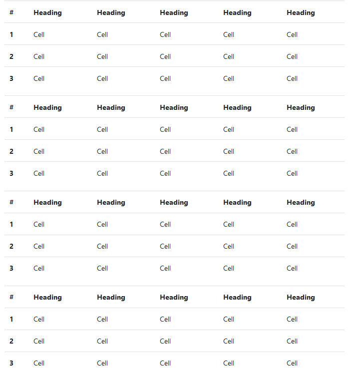
レスポンシブな表を使用すると、水平方向に表を簡単にスクロールできます。.table-responsiveで.tableをラップすることによって、すべてのビューポートで対応する表を作成します。あるいは、.table-responsive{-sm|-md|-lg|-xl}を使用することで、レスポンシブな表を持つ最大のブレークポイントを選択します。
垂直の切り抜き/切り捨て
Vertical clipping/truncation
レスポンシブな表は、表の下端や上端を越える内容を切り捨てるoverflow-y: hiddenを使用して作成します。特に、これは、ドロップダウン・メニューと他のサードパーティ製のウィジェットを切り捨てることができます。
常にレスポンシブ
Always responsive
すべてのブレークポイントにわたって、水平にスクロールする表のために、.table-responsiveを使用します。
<div class="table-responsive">
  <table class="table">
    ...
  </table>
</div>
ブレークポイント固有
Breakpoint specific
特定のブレークポイントまでレスポンシブな表を作成するために、必要に応じて、.table-responsive{-sm|-md|-lg|-xl}を使用します。そのブレークポイント以上から、表は、通常は動作して、水平にスクロールしません。
<div class="table-responsive-sm">
  <table class="table">
    ...
  </table>
</div>

<div class="table-responsive-md">
  <table class="table">
    ...
  </table>
</div>

<div class="table-responsive-lg">
  <table class="table">
    ...
  </table>
</div>

<div class="table-responsive-xl">
  <table class="table">
    ...
  </table>
</div>